Wrexham AFC is the oldest Football Club in Wales with two of the shiniest new owners in British Football, as seen in the FX series ‘Welcome to Wrexham’.
As big fans of the show, Cub wondered how it might be if the gang got rebranded.

The proposed crest is an evolution of the existing mark. It reimagines the classic heraldic logo, bringing added importance to key design features and breathing new life into the ‘Red Dragons’ brand.
Keeping many of the original ingredients of the existing mark, our proposal seeks simply to improve the recipe.
The crest retains the coronette of three silver feathers, the founding date of the club and of course the dual Red Dragons.
Extra emphasis is now placed on the chevron, that represents the upward future advance of the club!

Dating back to 1864, historic clubs like Wrexham often take their club branding from a local coat of arms, for which symbolism is all important. As such, many vital elements are at play within the crest and each must be balanced, distinct and legible.


The proposed branding features a new type treatment. We have used the Hydrella face by Ayca Atalay as it has a lovely interface between the ‘E’ and the ‘X’ as well as feeling a bit Welsh. We aren’t being paid for this.
Relying heavily on Welsh national imagery, the current design features the motto of the of the Prince of Wales.
Curiously, the German words ‘Ich Dien’ meaning ‘I Serve’, can be rendered phonetically into Welsh as ‘Eich Dyn’, meaning ‘Your Man’. Some believe this to have been the original (and much more whimsical) motto of the Princes Coat of Arms.
The proposed brand features a simplified version of the crest to sit with the motto in tribute to its historic use.


Proposed colour palette

Existing colour palette
The use of a depth palette allows for various sublimated brand elements and textures. These include various chevron patterns as well as a textured ‘Dragon Scales’ inspired by the team’s nickname.
The proposed colours of the palette are tonally distinct from each other for clarity and red-green visibility.

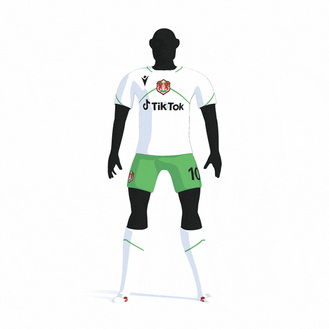
The team uniform is the most obvious expression of a sporting brand. The proposed Wrexham AFC home uniform features the crest centrally on the jersey as it has in the 1980’s.
The chevron features throughout the design, emanating from the crest. The element is used in subtle details throughout the uniform and creates space for sublimated texture and supplementary marks.
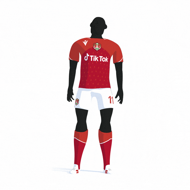
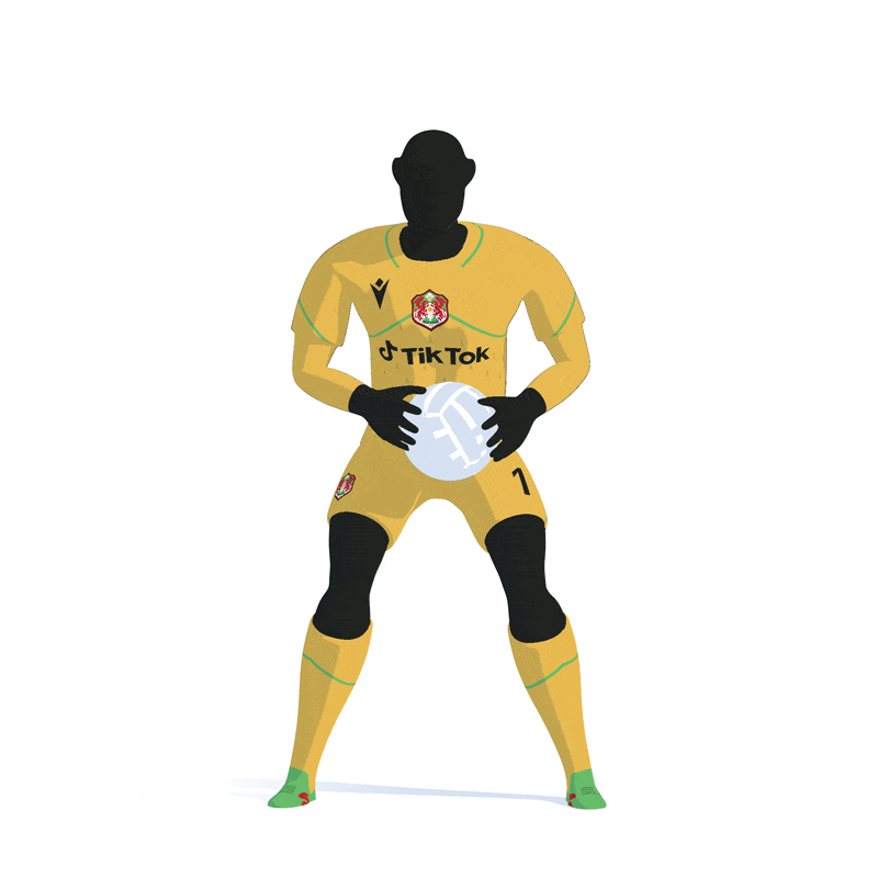
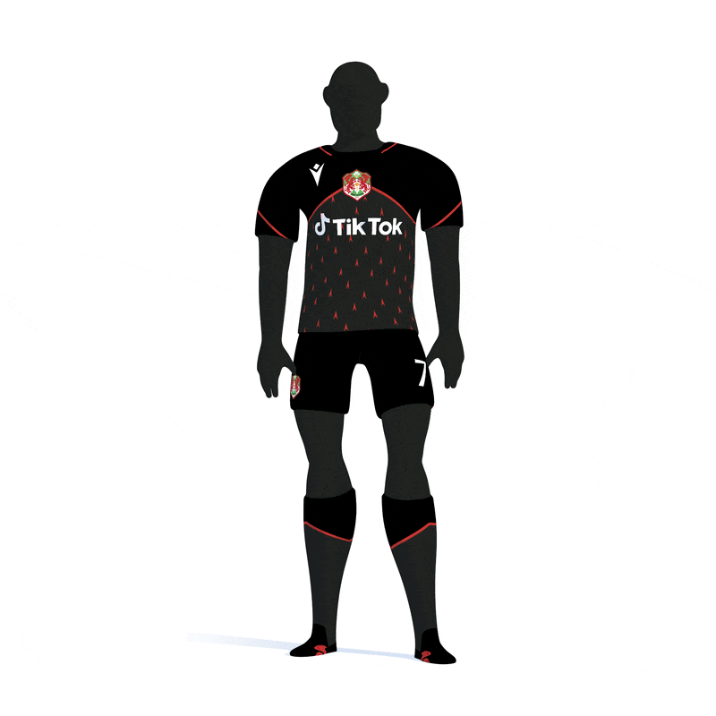
Below are further concepts created for the Away, Third and Goal Keeper uniforms.